


Jun 2025 - Today

Brand Overview
Brand Overview
HiMambo is a sustainable travel platform built around a simple idea: that a trip should leave both the traveler and the destination better off. Rather than positioning itself as another booking site, HiMambo connects conscious explorers with authentic, community-rooted experiences.
HiMambo is a sustainable travel platform built around a simple idea: that a trip should leave both the traveler and the destination better off. Rather than positioning itself as another booking site, HiMambo connects conscious explorers with authentic, community-rooted experiences.


Pain
Pain
Problem statement
Problem statement
Sustainable travel is a crowded, skeptical category. Travelers want trips that do real good, but "eco" and "sustainable" have become marketing words stretched thin by overuse. Meanwhile, the local guides, families, and cooperatives who host these experiences are often the least visible part of the booking process, buried behind agencies and platforms that keep most of the value for themselves.
Sustainable travel is a crowded, skeptical category. Travelers want trips that do real good, but "eco" and "sustainable" have become marketing words stretched thin by overuse. Meanwhile, the local guides, families, and cooperatives who host these experiences are often the least visible part of the booking process, buried behind agencies and platforms that keep most of the value for themselves.
As a result:
Travelers can't easily tell which trips are genuinely community-led versus just marketed that way.
Trust has to be re-earned on every single listing, which slows bookings and raises drop-off
The people who make the experience possible — local hosts and communities — stay invisible in the brand story.
As a result:
Travelers can't easily tell which trips are genuinely community-led versus just marketed that way.
Trust has to be re-earned on every single listing, which slows bookings and raises drop-off
The people who make the experience possible — local hosts and communities — stay invisible in the brand story.
As a result:
Travelers can't easily tell which trips are genuinely community-led versus just marketed that way.
Trust has to be re-earned on every single listing, which slows bookings and raises drop-off
The people who make the experience possible — local hosts and communities — stay invisible in the brand story.

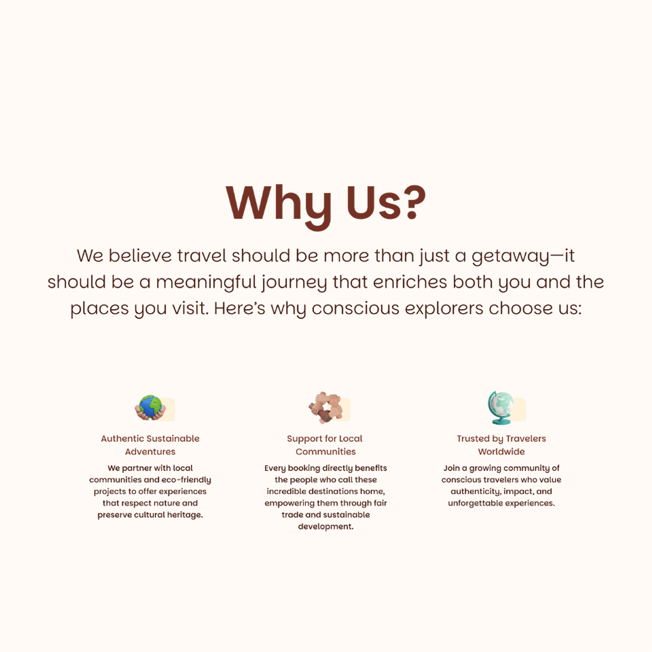
Solution
How HiMambo Fits
For HiMambo, the challenge was clear: build a brand and a booking experience that make sustainability legible at a glance, so travelers can book with confidence and communities get top billing, not a footnote.
For HiMambo, the challenge was clear: build a brand and a booking experience that make sustainability legible at a glance, so travelers can book with confidence and communities get top billing, not a footnote.
Key pain points we aimed to solve:
Key pain points we aimed to solve:
Invisible impact: travelers have no easy way to see who benefits from their trip
Generic "eco" branding: sustainability claims blur together across competitors with no distinct visual identity
Overwhelming trip discovery : too many listings, not enough guidance toward the right experience
Low booking confidence: no clear trust signals at the point of decision
Solution
How HiMambo Fits


Method Used
Creative Process | HiMambo
Brand Design System
Digital Experience
1.
Strategy & Approach
Strategy & Approach
We positioned HiMambo as the human-first alternative to generic travel marketplaces. While most platforms sell destinations, HiMambo sells relationships — with places, hosts, and communities. The approach centered on three principles:
Warmth: a visual identity that feels handmade and human, not corporate travel-tech
Transparency: make the community and sustainability story visible on every screen, not buried in an About page
Confidence: give travelers enough trust signals to book without second-guessing
2.
Brand & Trust Layer
Brand & Trust Layer
The identity system itself does trust-building work, not just decoration:
A leaf and wave mark that visually fuses land and water the two things every trip touches.
A warm, earth and growth color palette instead of the generic "eco-green" every competitor uses.
Consistent iconography for community, conservation, and fair-partnership messaging, repeated across every touchpoint.
A documented logo and usage system so the brand stays consistent as HiMambo adds new destinations
The identity system itself does trust-building work, not just decoration:
A leaf and wave mark that visually fuses land and water the two things every trip touches.
A warm, earth and growth color palette instead of the generic "eco-green" every competitor uses.
Consistent iconography for community, conservation, and fair-partnership messaging, repeated across every touchpoint.
A documented logo and usage system so the brand stays consistent as HiMambo adds new destinations
3.
UI/UX Visual workflow
UI/UX Visual workflow
The visual workflow was designed to move a traveler from inspiration to booking with as little friction as possible:
Search-first hero section, so intent turns into action immediately
Curated experience cards with ratings, tags, and short community context
Destination-led browsing for travelers who start with a place, not a trip type
Testimonials placed close to the decision point, not buried in a separate page
The visual workflow was designed to move a traveler from inspiration to booking with as little friction as possible:
Search-first hero section, so intent turns into action immediately
Curated experience cards with ratings, tags, and short community context
Destination-led browsing for travelers who start with a place, not a trip type
Testimonials placed close to the decision point, not buried in a separate page

1.
Strategy & Approach
We positioned HiMambo as the human-first alternative to generic travel marketplaces. While most platforms sell destinations, HiMambo sells relationships — with places, hosts, and communities. The approach centered on three principles:
Warmth: a visual identity that feels handmade and human, not corporate travel-tech
Transparency: make the community and sustainability story visible on every screen, not buried in an About page
Confidence: give travelers enough trust signals to book without second-guessing
2.
Brand & Trust Layer
The identity system itself does trust-building work, not just decoration:
A leaf and wave mark that visually fuses land and water the two things every trip touches.
A warm, earth and growth color palette instead of the generic "eco-green" every competitor uses.
Consistent iconography for community, conservation, and fair-partnership messaging, repeated across every touchpoint.
A documented logo and usage system so the brand stays consistent as HiMambo adds new destinations
3.
UI/UX Visual workflow
The visual workflow was designed to move a traveler from inspiration to booking with as little friction as possible:
Search-first hero section, so intent turns into action immediately
Curated experience cards with ratings, tags, and short community context
Destination-led browsing for travelers who start with a place, not a trip type
Testimonials placed close to the decision point, not buried in a separate page
Rebranding & Platform Improvement
Design Impact | HiMambo
Before
After
Turning Generic Travel-Tech Into a Trust-First Platform
Turning Generic Travel-Tech Into a Trust-First Platform
The redesign kept the booking flow travelers already understood, but rebuilt every screen to lead with the same thing: proof, not promises. Placeholder language, generic e-commerce patterns, unexplained trust badges and inconsistent image styles were replaced with real storytelling, clearer hierarchy, and sustainability signals travelers can actually verify.
The redesign kept the booking flow travelers already understood, but rebuilt every screen to lead with the same thing: proof, not promises. Placeholder language, generic e-commerce patterns, unexplained trust badges and inconsistent image styles were replaced with real storytelling, clearer hierarchy, and sustainability signals travelers can actually verify.
Before
Design Analysis | HiMambo

B) Brand Identity
Before, the identity was a promising sketch a hand drawn ribbon and leaf logo and a basic sheet of swatches and fonts. Expressive, but not yet a system anyone could build on with confidence.
Color and contrast
Multiple greens and oranges with different saturations create visual chaos instead of a disciplined palette; it feels “template-ey,” not like a coherent brand system.
Some text on colored backgrounds likely fails WCAG contrast (e.g., yellow/orange blocks, white on light tones), hurting readability and accessibility.
Accessibility basics
No obvious indication of keyboard‑friendly focus, alt‑text strategy, or clear form labeling; for a travel site, that’s a serious accessibility gap.
Color is overused as a primary differentiator (colored stat blocks, pills) without robust textual cues, which conflicts with contrast and perceivability guidelines.


A) Landing Page
The home-page had good bones but lacked coherence and fails several best practice and accessibility basics: hierarchy is muddy, color/contrast is weak in places, copy is generic, and the UX is noisy and unfocused.
Hierarchy and focus
Hero tries to do too much: huge photo with weird filter, long headline, subheadline, dense search form, and nav all compete; users don’t get one clear primary action.
Section titles repeat, adding noise and diluting scannability.
Typography and copy
Headlines are too long and lack punch; best practices recommend short, clear hero text with tight supporting copy, this reads like marketing fluff.
Repetitive, placeholder‑style copy erodes trust and feels unprofessional.
UX of key components
Search bar in the hero is crowded and visually under‑structured; labels, spacing, and grouping are not clear enough for fast scanning or keyboard use.
Cards and CTAs lack strong hover/focus states and clear descriptive labels (lots of “Learn more”), which is poor for accessibility and conversion.
Before
Design Analysis | HiMambo
B) Brand Identity
Before, the identity was a promising sketch a hand drawn ribbon and leaf logo and a basic sheet of swatches and fonts. Expressive, but not yet a system anyone could build on with confidence.
Color and contrast
Multiple greens and oranges with different saturations create visual chaos instead of a disciplined palette; it feels “template-ey,” not like a coherent brand system.
Some text on colored backgrounds likely fails WCAG contrast (e.g., yellow/orange blocks, white on light tones), hurting readability and accessibility.
Accessibility basics
No obvious indication of keyboard‑friendly focus, alt‑text strategy, or clear form labeling; for a travel site, that’s a serious accessibility gap.
Color is overused as a primary differentiator (colored stat blocks, pills) without robust textual cues, which conflicts with contrast and perceivability guidelines.
A) Landing Page
The home-page had good bones but lacked coherence and fails several best practice and accessibility basics: hierarchy is muddy, color/contrast is weak in places, copy is generic, and the UX is noisy and unfocused.
Hierarchy and focus
Hero tries to do too much: huge photo with weird filter, long headline, subheadline, dense search form, and nav all compete; users don’t get one clear primary action.
Section titles repeat, adding noise and diluting scannability.
Typography and copy
Headlines are too long and lack punch; best practices recommend short, clear hero text with tight supporting copy, this reads like marketing fluff.
Repetitive, placeholder‑style copy erodes trust and feels unprofessional.
UX of key components
Search bar in the hero is crowded and visually under‑structured; labels, spacing, and grouping are not clear enough for fast scanning or keyboard use.
Cards and CTAs lack strong hover/focus states and clear descriptive labels (lots of “Learn more”), which is poor for accessibility and conversion.
Before
Design Analysis | HiMambo
A) Landing Page
The home-page had good bones but lacked coherence and fails several best practice and accessibility basics: hierarchy is muddy, color/contrast is weak in places, copy is generic, and the UX is noisy and unfocused.
B) Brand Identity
Before, the identity was a promising sketch a hand drawn ribbon and leaf logo and a basic sheet of swatches and fonts. Expressive, but not yet a system anyone could build on with confidence.
Hierarchy and focus
Hero tries to do too much: huge photo with weird filter, long headline, subheadline, dense search form, and nav all compete; users don’t get one clear primary action.
Section titles repeat, adding noise and diluting scannability.
Color and contrast
Multiple greens and oranges with different saturations create visual chaos instead of a disciplined palette; it feels “template-ey,” not like a coherent brand system.
Some text on colored backgrounds likely fails WCAG contrast (e.g., yellow/orange blocks, white on light tones), hurting readability and accessibility.
Typography and copy
Headlines are too long and lack punch; best practices recommend short, clear hero text with tight supporting copy, this reads like marketing fluff.
Repetitive, placeholder‑style copy erodes trust and feels unprofessional.
Accessibility basics
No obvious indication of keyboard‑friendly focus, alt‑text strategy, or clear form labeling; for a travel site, that’s a serious accessibility gap.
Color is overused as a primary differentiator (colored stat blocks, pills) without robust textual cues, which conflicts with contrast and perceivability guidelines.
UX of key components
Search bar in the hero is crowded and visually under‑structured; labels, spacing, and grouping are not clear enough for fast scanning or keyboard use.
Cards and CTAs lack strong hover/focus states and clear descriptive labels (lots of “Learn more”), which is poor for accessibility and conversion.
After
A clear value proposition | HiMambo
A clear value proposition

From a decorative mark to a Brand with meaning

the loose ribbon logo became a leaf and wave symbol built on a real construction grid, with every curve tied to a stated rationale: the wave for motion and "the vibrant rhythm of mambo," the leaf for nature and growth.
Harmonious and useful Color Palette: we moved from a set of unnamed swatches to a full Range of 5 colors each carrying a defined function.
Typography grew up: Parkinsans's casual roundness keeps the brand approachable while reading as more considered and scalable across weights.
A logo sheet became a full CI Manual: clear space and logo sizing were joined by an exact construction grid, minimum-size specs for print and digital, spacing scale, elevation, border radius, and real CI-in-context examples, so the identity can be applied consistently across a full product, not just a logo lockup.
From a decorative mark to a Brand with meaning
the loose ribbon logo became a leaf and wave symbol built on a real construction grid, with every curve tied to a stated rationale: the wave for motion and "the vibrant rhythm of mambo," the leaf for nature and growth.
Harmonious and useful Color Palette: we moved from a set of unnamed swatches to a full Range of 5 colors each carrying a defined function.
Typography grew up: Parkinsans's casual roundness keeps the brand approachable while reading as more considered and scalable across weights.
A logo sheet became a full CI Manual: clear space and logo sizing were joined by an exact construction grid, minimum-size specs for print and digital, spacing scale, elevation, border radius, and real CI-in-context examples, so the identity can be applied consistently across a full product, not just a logo lockup.
From a decorative mark to a Brand with meaning
the loose ribbon logo became a leaf and wave symbol built on a real construction grid, with every curve tied to a stated rationale: the wave for motion and "the vibrant rhythm of mambo," the leaf for nature and growth.
Harmonious and useful Color Palette: we moved from a set of unnamed swatches to a full Range of 5 colors each carrying a defined function.
Typography grew up: Parkinsans's casual roundness keeps the brand approachable while reading as more considered and scalable across weights.
A logo sheet became a full CI Manual: clear space and logo sizing were joined by an exact construction grid, minimum-size specs for print and digital, spacing scale, elevation, border radius, and real CI-in-context examples, so the identity can be applied consistently across a full product, not just a logo lockup.
Projected Brand Impact
Core Changes | HiMambo
Outcome

Faster booking decisions: clearer trust signals at the point of choice shorten the path from browsing to booking.
Higher perceived credibility: a distinct and cohesive visual identity separates HiMambo from generic "eco-travel" competitors.
Stronger emotional connection: community-first storytelling turns a transaction into a relationship.
More consistent brand presence: a documented identity system keeps every new destination page on-brand as the catalog grows
Faster booking decisions: clearer trust signals at the point of choice shorten the path from browsing to booking.
Higher perceived credibility: a distinct and cohesive visual identity separates HiMambo from generic "eco-travel" competitors.
Stronger emotional connection: community-first storytelling turns a transaction into a relationship.
More consistent brand presence: a documented identity system keeps every new destination page on-brand as the catalog grows
Faster booking decisions: clearer trust signals at the point of choice shorten the path from browsing to booking
Higher perceived credibility — a distinct visual identity separates HiMambo from generic "eco-travel" competitors
Stronger emotional connection — community-first storytelling turns a transaction into a relationship
More consistent brand presence — a documented identity system keeps every new destination page on-brand as the catalog grows
What the Design Taught Us
Always learning | HiMambo
Takeways
Progressive disclosure beat a longer form every time: splitting sign-up into steps, with visible progress, made the same set of fields feel lighter to complete than any copy tweak could on a single long page.
Copy is a UI element, not a placeholder: swapping lorem ipsum for one real detail (a village name, a craft, a person) changed how trustworthy a whole screen felt more than any layout change on that same screen.
Small components carry the brand more than hero moments do: the same SDG tag, wishlist icon, and rating pattern repeating across the homepage, search results, and detail page built more perceived consistency than any single flagship screen
A design system is only as strong as its edge cases: clear space and minimum size were the easy part; the harder, more useful questions were what happens when a partner uploads an off-brand photo or writes a two-line bio
Hierarchy is a trust decision, not just a visual one: what got the top of the page (a headline promise, a search bar, a partner's name) said as much about what HiMambo values as any paragraph of brand copy did.
Two audiences meant two kinds of onboarding, not one flow adapted twice: travelers needed speed, partners needed reassurance, and forcing both through the same steps would have undersold one side of the marketplace.


Trusted by Professionals
Trusted by Professionals
Here are insights from clients and colleagues I've had the opportunity to work with, mainly small businesses and startups, where I've contributed to a lasting brand presence in competitive markets.
Here are insights from clients and colleagues I've had the opportunity to work with, mainly small businesses and startups, where I've contributed to a lasting brand presence in competitive markets.