

Marea - Branding, Menu & Website
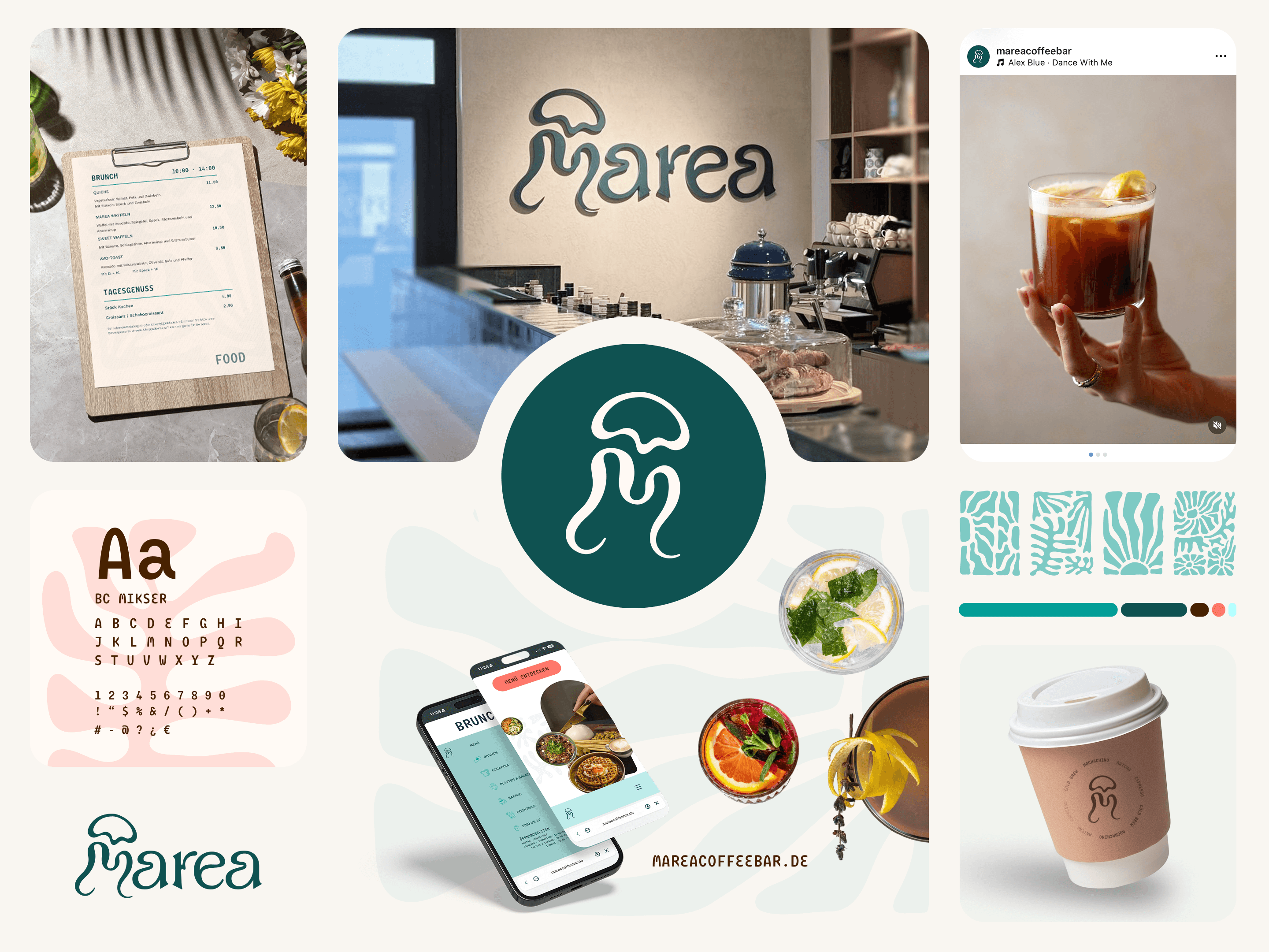
My focus was to build a visual system that felt consistent across brand touchpoints while also supporting discovery and engagement online. I developed the logo, typography, color palette, and supporting design elements, then applied them to a responsive landing page that communicates the café’s personality clearly and elegantly


The Challenge
The client arrived with a strong creative direction, including a moodboard, color palette, and the wish for a trendy brand with a mascot. Based on these inputs, I explored several logo and typography directions, then refined the system to improve readability, consistency, and brand recognition

Trend-oriented designs risk visual similarity across competitors, making it essential to prioritize both readability and brand differentiation.
The palette lacks strong contrast: most tones are muted and similar in brightness, which can reduce readability and weaken visual hierarchy. This low contrast also limits brand distinction, making it less memorable and harder to recognize in various applications or on digital screens.

Concepts:
creating a Mascot + Wavy yet readable font
Refinment
Following feedback and discussion, the design direction evolved to include a refreshed color palette and a mascot to enhance brand recognition. The original wavy typography inspiration was refined to balance personality with readability and long-term appeal.

The Result
Balance
Memorable
Approachable
mascot, helping Marea feel more playful, warm, and recognizable.